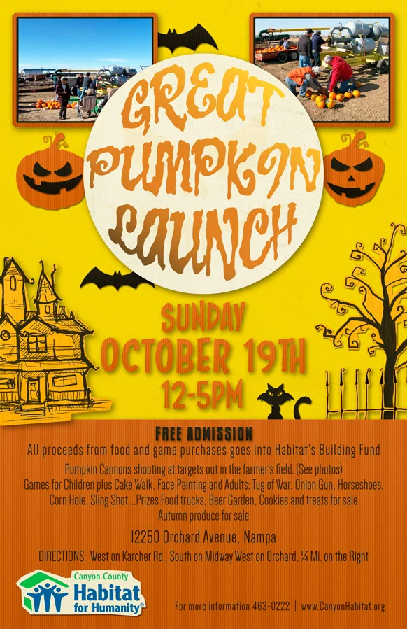
Habitat for Humanity Event Poster
This week has been a change of pace. I was contacted by the charity organization Habitat for Humanity about making an 11×17″ advertisement poster for them for an upcoming event. I like to be able to donate my time and talents for good causes and this was especially fun because it was going to be Halloween themed and I am a big fan of Halloween.
The event and choosing the poster style
The Habitat for Humanity organization is doing an upcoming pumpkin launch event. This is like that “Punkin Chunkin” show on the Science channel where people build these large cannons that shoot pumpkins. Along with that, there are going to a number of games, activities and booths for children and adults. When designing the poster, I knew that I wanted it to be kid friendly, but not so much so that adults would roll their eyes at it. Recently, while working on illustrating a children’s book, I toyed around with the idea of virtual paper cut outs as a look and style. I decided to see if I could apply that style to this poster. It was fun and I felt it would help make the poster pop.
Creating the poster
What I got from Habitat for Humanity was limited. They emailed me the information, a small logo, and 2 small photos and just said they wanted it to be a Halloween themed poster. So I started out where I usually start, and that is with the colors. I browsed around online a bit looking at Halloween images and along with my own experience with Halloween came up with a set of 5 color swatches that I would use for the poster. From there, I threw in the background color, divided the poster into thirds, and went to town designing a few Halloween elements. Once I had a few done, I worked with getting the paper cut out look I wanted, and once that was done, and I knew I had a set look that would work, I started designing the text elements and the overall placement of elements.

At full size you can see the detail and texture better.
Finalizing poster elements
Once I found the typefaces I wanted, altered them to fit my design, considered legibility, and had all the text where I wanted, I proceeded to my final layout. I added some more Halloween elements like bats and the black cat. I “cut” around my house, tree, fence, and the logo, giving them a paper look. Then I created a couple of backgrounds for the two photos I would use at the top. To add the final touch, I added textures to all of the surfaces. The textures are difficult to see on the computer but in print they really make a difference.
In the end, I really enjoyed making this poster and I’m glad that it is for a good cause. If you happen to be local and want to have a lot of fun while supporting a good cause, you should consider going to the Great Pumpkin Launch this October 19th from 12-5pm. It will be at 12250 Orchard Avenue in Nampa Idaho. Directions and more information on the poster 😉
Be sure to follow in facebook, google+, twitter (links on the right) and sign up for the newsletter for up-to-date news, interesting links, articles, and contests as well. Thank you for reading and as always, please comment, like, and share with your friends.